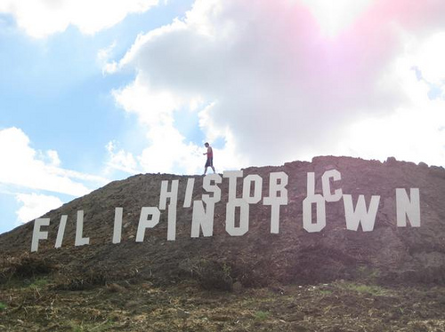
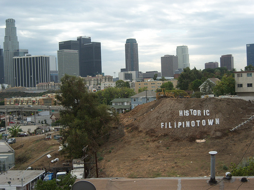
Who cleared this signage?
PinoyLifer Valleypinoy sent a post on curbed.com regarding some new signage in L.A.’s Historic Filipinotown.
Take a look at these photos found on Matt Nelson’s flickr page


Somebody, I don’t know who, but somebody put this sign up on a dirt mound in Historic Filipinotown. I guess the signs on major street posts in Historic Filipinotown that say “Historic Filipinotown” weren’t good enough to let you know where you were.
Pinoy pride is great and all but the sign looks like shit if you ask me. It kinda reminds me of the illegitimate bastard child of the Hollywood sign and the South San Francisco sign.
Thoughts?
Comments
27 Responses to “Who cleared this signage?”
Leave a Reply


i don’t think it’s as bad as the south san francisco signage. that one looks like it was made with chalk.
Anyone down to roll over there and re-arrange the letters to say
“chronic pistol if I own it”
Some other “historic filipinotown” anagrams that got sent in
No oil if I tip wino christ
and
HONORIFIC TWIN PILOTS (thank you Ryan for that one)
You guys got any other ideas on how we can rearrange these letters?
Ok one more
I C Filipino Shit Rot Now
I would just make it say “MANNYWOOD.” Which Manny?
We can leave that up to interpretation.
Fukkit, let’s just make it say, “PINOYLIFE.COM”
Where are we going to get the Y, the dot, and the M?
how about
i fo i (eye for eye), pcn wil rot shit on i
Aww, it doesn’t look too bad.
Anyways, how about “I own fist politic rhino”.
Or just take down a bunch of letters and leave it “ho town”.
‘O Honrific Nitwit Lips!’
poetic. catchy. not as cheesy. and more appropriate for an ugly dirt mound.
Let’s not rearrange the letters !! Let’s just relocate the letters to another location instead !!!! Like to a CostCo, Seafood City Groceries, Eagle Rock Plaza – “SM MegaSmall” or in front of a Jollibee fast food store. That’s just my 2 cents. Any other suggestions for relocation ?!
Here’s a novel idea. Let’s move the letters to the real Historic Filipinotown which is currently Little Tokyo.
HAHAHAHA…I agree on just moving the letters to another spot, but dunno where. The letters remind me of the “ToonTown” letters at Disneyland for some reason.
Hey KoRN, we should move it to Oxnard.
I think someone should just take a ruler out there and freaking straighten that thing. Not only does it make it look half assed, but it makes it look like we can’t even afford to put in on solid ground.
And for God Sake’s, someone center that thing.
Here’s a slight anagram you can make, but you gotta take out some letters, and it describes what the sign looks like:
shitorific
Oh yeah, and that sign totally belongs in Panorama City. We could put it on top of my High School (ST. GEN’S!) and it could overlook Chase Park.
The should put that sign on top of Serramonte mall.
The South San Francisco sign isn’t that bad.
btw
thanks for bringing back Pinoylife Moonie, I was bored at work and
decided to see if anything would happen and it worked!
hahaha…Oxnard is a good idea, we can put it on “the grade” coming down the 101 into Camarillo so everyone can see it
Ow, Filipino Choir Stint
Nice. hehe.
Well.. it looks much better than the chinatown land sign.
(lightbulb)… hey, folks: whaddaya say to a PHOTOSHOP CONTEST?!
I actually think the sign is cool. Look, I’m just happy that it isn’t something idiotic like “Historic Fliptown” or “South Echo Park” or “FACLA” with an arrow pointing toward Temple St.
that sign is fuckin awesome.
Appreciate it for sharing Who cleared this signage? | PinoyLife.com with us keep update bro love your article about Who cleared this signage? | PinoyLife.com .
I was curious if you ever considered changing the layout of your site? Its very well written; I love what youve got to say. But maybe you could a little more in the way of content so people could connect with it better. Youve got an awful lot of text for only having 1 or 2 images. Maybe you could space it out better?
I’ve said that least 2925635 times. The problem this like that is they are just too compilcated for the average bird, if you know what I mean